In praise of plain text emails

When Sopro first started off we were already sure about two things.
- We would use tech to create a scalable prospecting solution.
- We would use plain text emails to prospect with.
Clients often ask us why the hi-tech/lo-tech mix and just what is it with you and plain text emails?
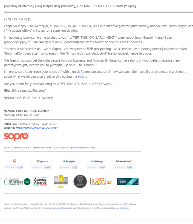
Here’s what a typical Sopro prospecting email looks like.

As you can see it’s not strictly plain text.
The email footer carries the company logo and sometimes – if that is your way – a headshot of the sender.
But the rest of the mail is plain text.
There’s no clever use of fonts, no borders, no images and – more often than not – there’s no bold, underlining or italics. And links are conspicuous by their absence.
It’s not that HTML is a four-letter word to us, it’s just that we want our mails to look one-to-one.
- A hastily typed note having realised you can help someone.
- A fired-off email sent from Pauline to ‘make an intro’ to George.
These spontaneous acts of communication are not the type of thing you labour over or hand to marketing to pretty up.
You write and send.
And on receipt it doesn’t feel or look like a polished advertisement or sales pitch. It feels personal – and therein lies its power.
- At heart, people respond to people more than they do marketing departments.
- They trust notes more than they trust corporate brochures.
- They reply to mails from individuals more than they reply to mass mailers.
And this is what we love about the plain text.
But we’re not alone.
LinkedIn and the power of the plain text post
Study after study finds that good old text posts continue to get more views – and often more engagement – than those embellished with images, slides or videos.
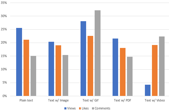
Here are the results of just one such study. This shows the percentage of total views, likes and comments each type of post gets.

Note to self: do more plain text posts on LinkedIn.
- As you can see views of a plain text post tower over video, PDF and image.
- It has the second highest number of likes.
- Comments are not so hot – but it remains neck and neck with image and PDF posts.
Is it too much to imagine that what we are seeing here are people responding positively to posts that they see as created by people (rather than piggy backing on the latest corporate content marketing tactic)?
We don’t think so.
Plain text emails at work
We recently stumbled across this fascinating piece of research that argues strongly for using plain text email for eCommerce.
‘Email marketing gravitates toward robust, splashy HTML emails. We’re talking epic product shots, lots of fonts and colours, big call-to-action buttons, and now even videos and GIFs.
This might sound counterintuitive, but sometimes it’s worthwhile to strip away all of those bells and whistles and send out a plain text email.
Yes, plain text. Just black text on a white background in the default font with a blue, underlined link.’
Plain text mails have been found to have higher clickthrough and conversion rates.
- In every single A/B test, the simpler designed email won. The emails with fewer HTML elements won with statistical significance.
- Plain text emails had a 17 percent higher unique CTR and a 21 percent higher click-to-open rate.
- In an A/B test of 100,000 users, a text version of an email brought 194.5% more visitors to the website than an image-heavy version—and 303% more revenue.
Plain text feels personal – as if it were from a person rather than a ‘department’ or a ‘thing’. These are the sorts of emails that get our attention.
But it’s more than this.
Plain text also encourages responses. Take Cience, a B2B marketing company. They found that their response rate was 400 to 900% higher with plain text rather than HTML.
And it just gets better.
Plain text also has better deliverability, compatibility, and readability.
If we weren’t already, we’d say we’re sold.
How about you?


Share