4 ways to make your landing page kick-ass

When it comes to marketing, the landing page can be your tool to turn everyday traffic into a lead laboratory.
Whether your visitors are coming from prospecting or PPC, SEO or social media, a great landing page can make or break your campaigns. And we’re going to reveal four ways to get them rocking.
But first, you’ll need to slip into this tight spandex suit, learn some martial arts moves and equip yourself with a few homemade weapons.
Because we’re about to kit up your landing page into a kick-ass, lead driving superhero.
Let’s do this.
- Personalise the experience
We are in the dying days of the one-size-fits-all landing page.
Breathe new life into your conversion rates by using interactive content: serve up an enticing, engaging page that speaks to each prospect and your lead rates will climb.
Allowing visitors to customise the content they view is a great way to ensure they have the best experience – the kind that makes them sign up for more.
There are various ways you can do this, some more technical than others.
To get all dynamic and flash, you can use tools that adapt landing pages in real-time, using data-based profiles to personalise your page to each visitor.
Or you can allow visitors to tailor the page according to their interests, by asking them to choose between two options.
Finally, a simple solution is to insert links with parameters in your emails, which means each email has a personalised link that leads to a personalised web page.
Any of those solutions should see your conversions rise.


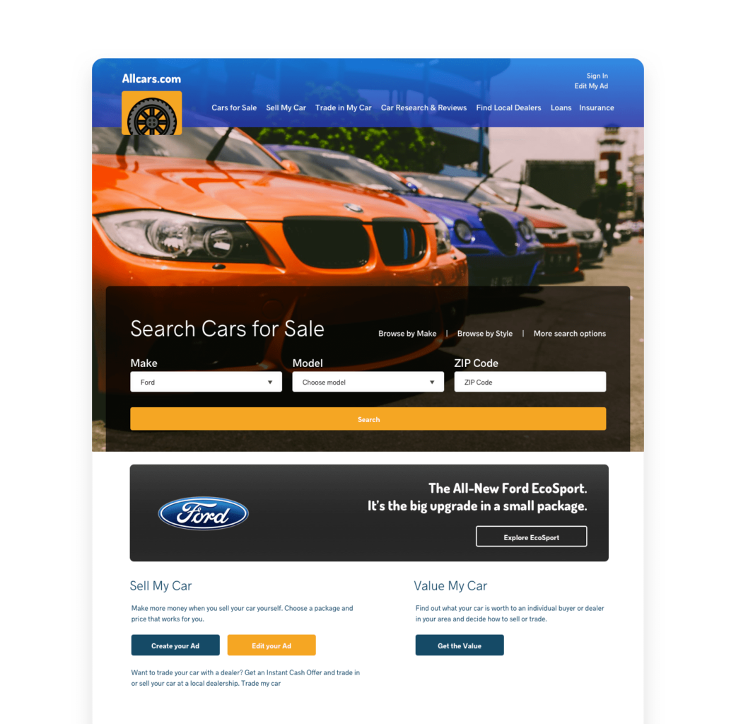
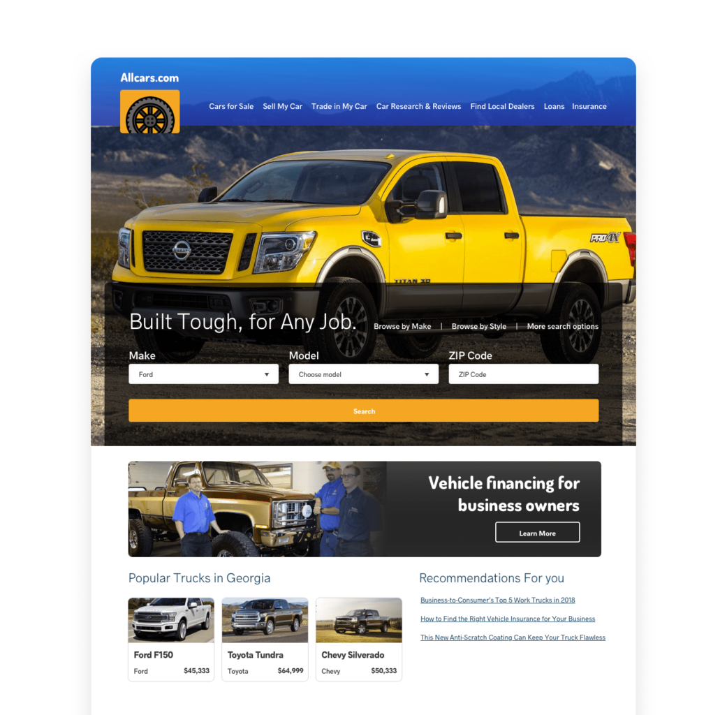
This US car dealer’s landing page dynamically displays different content based on geographic, time, keyword, source and visitor profile data.
- Explain with videos
The explainer video was made for landing pages.
Rather than a lengthy description of what you do, you can quickly show your visitors exactly what benefits you deliver.
While video has now become an almost obligatory part of the online experience, it is worth concentrating on explainer videos for your landing pages.
These short video clips keep everything top level. They walk you through what your solution does but critically, what the benefits are.
HubSpot reports that 94% of people will watch explainer videos and 84% say that these videos influence them into a buying decision.
.
- Optimise your forms
This one, we recognise, may be controversial. But it’s worth considering nonetheless.
There is a lot to be said for using the simplest form possible to increase sign-ups. You can then work on gathering data after the sign-up rather than during the sign-up itself.
The simple fact is that no one enjoys filling out forms. The more questions you ask, the more people start to question whether they actually need the thing they are signing up for.
One solution is to strip everything right back and go for email and name data collection only on your forms (stretching to company if you must, although you may be able to work that out from their email).
In their comprehensive review of forms on landing pages, Omnisend discovered that there is a sharp drop off in conversion rates if more than three questions are asked.
Gosh, shock, horror!
How are you going to qualify your leads or personalise future communication?
One answer is to use AI and different data sources to plug some gaps and then, as you build your relationship, you can solidify your information about your lead.
The important thing is that you have made contact, collected data and have a prospect there for qualifying rather than a hazy record of a fleeting pixel in your web analytics.
- Never leave them hanging round (because they won’t)
Where landing pages are concerned we can’t emphasise enough the importance of page speed.
Page speed is critical to conversions – you ignore it at your peril.
Google made Core Web Vitals a critical part of its search algorithm in 2021 and did so for good reason. A faster website is a better experience for everyone.
As HubSpot reports, conversion rates drop by an average of 4.4% with each added second of load time
This means that having a quick load time is more important than ever. Compress those images, implement lazy-load, and do whatever else .
‘Now, get out there and kick ass!’
So, there you have it: four very actionable things that will make your landing page kick ass.
Let’s kick some lead generation butt!

The State of Prospecting 2024
An in-depth look at the tactics and trends shaping successful B2B prospecting in 2024.
Download it


Share